Why Your Color Grading SUCKS & how to fix it
 Jordy Vandeput
53K views
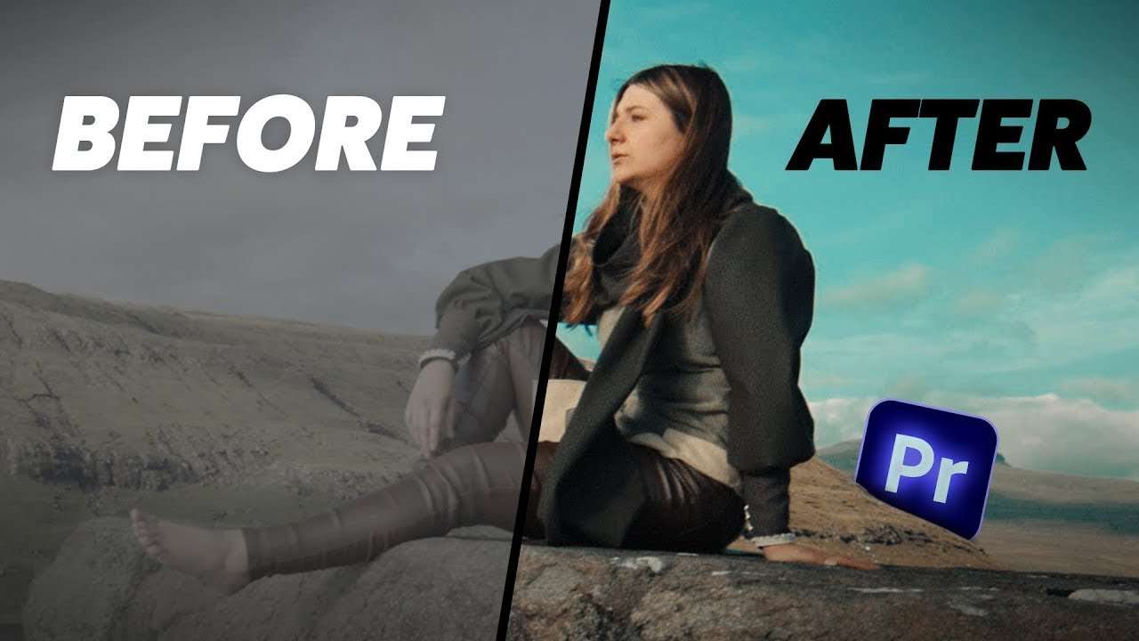
Learn how to make your color grades look cinematic and professional using these five tips in this Adobe Premiere Pro tutorial video.
Creating a unique grade
Lots of people have trouble achieving a beautiful color grade for their projects. Well you don't have to worry anymore, with these 5 tricks in this tutorial, you will learn how to improve your color grades to a professional level!

Creative color grading
Of course you have to follow a few rules if you want your grade to look good. But that doesn't mean that you can't get creative. In this shot for example, we want the talent to pop on the mountain. The foreground is a little bit too bright which prevents people from seeing the talent first.
What you can do to fix that is decrease the exposure of the entire video. Then create a mask on the Lumetri effect and draw it around the foreground. Once you've feathered the mask, you're basically done. You can also decrease the saturation to remove the colors from the foreground, this will make the talent pop even more.
Filmconvert
Big thanks to Filmconvert! Color matching different cameras or adding cinematic grain to your videos can be done with their amazing plugins! Get 10% off CineMatch and Filmconvert Nitrate!
Jordy Vandeput
Founder of Cinecom · 2.75M+ subscribers on YouTube
Jordy Vandeput is a Belgian filmmaker who has taught practical filmmaking to millions through Cinecom. He breaks professional techniques down into clear, repeatable steps you can use on your very next project.







0 comments